

Key Takeaways:
- Power BI finance dashboards provide real-time visibility into cash flow, profitability, AR/AP, budgets, and forecasts by integrating data from ERP and accounting systems.
- Finance dashboards deliver the highest value when designed for specific roles such as CFOs, finance controllers, FP&A teams, and AR/AP managers, each aligned to distinct decision-making needs.
- Core finance KPIs tracked in Power BI dashboards include cash flow, gross margin, net profit, AR/AP aging, working capital, budget vs actuals, and forecast accuracy.
- A mature finance analytics environment typically includes 15–20 dashboards, covering P&L, balance sheet, cash flow, budgeting, forecasting, compliance reporting, and executive scorecards.
- Power BI replaces manual Excel-based reporting by automating data refreshes, improving data accuracy, and reducing finance reporting effort by up to 90 percent.
- Effective Power BI finance dashboards are built by defining business decisions, selecting 5–10 critical KPIs, integrating ERP and financial data sources, modeling metrics, and deploying secure, automated reports.
In today’s business landscape, where data is increasingly recognized as a critical asset for informed decision-making, finance teams play a pivotal role as custodians of vast organizational data.
With Power BI’s strong, precise business intelligence and analytics, finance executives can gain a grip on data-driven insights, enabling them to support strategic processes with professionalism.
By leveraging Power BI, finance departments can go deeper than ever before to uncover crucial insights into financial data, thereby combining operational understanding with the wider company’s decision-making to drive greater business success.
Power BI Dashboards for Finance and Accounting
Power BI Dashboard for Finance and Accounting gives you the leverage to track different finance-associated metrics and KPIs.
Such a dashboard helps you plan your capital and cash management strategies well, as you can quickly overview where your company’s cash flow and liquidity stand. Another significant benefit of a finance dashboard is that it enables you to record key business data, such as sales expenses, accounts payable, and accounts receivable. This way, you can ensure getting through all payments and invoices to stay afloat and keep business bills under control.
Why is Power BI Useful for Finance & Accounting?
Power BI can group and gather information from multiple systems to present the whole picture of business data analytics in one “single view”. It enabled the financial institution’s staff to work on a collective digital platform to compute and share relevant data.
Moreover, Power BI includes both solid data applications and advanced financial modeling capabilities. These tasks include range analysis, trait identification, scenario planning, and forecasting – all made possible by the DAX language, which is the most flexible of all. Among Power BI’s most powerful features is the dashboard, which uses visual representations to break down complex financial data into more understandable formats in an engaging style. Real-time charts and graphs generated from actual financial data will enable different departments in your company to use them more strategically. This implementation of financial alignment will bring the board together.
Here’s how Power BI helps the finance & accounting teams:
- Data presentation attractiveness through the usage of diagrams, tables, charts, and graphs.
- Information from sources such as weather stations, aviation data providers, and satellites is updated in real time and aggregated into centralized datasets.
- The drag-and-drop feature makes it easy for end users to customize their reports.
- Easy Linking of Power BI dashboards and other platforms for getting data.
- End-user interactive roll-up/pivot functionality for data.
Want to see how a real finance team uses Power BI to replace Excel-heavy reporting with automated dashboards? Consult our Power BI development experts now.
Why do finance professionals choose Power BI?
Power BI has become the tool of choice for financial reporting in organizations transitioning from manual processes to automated analytics.
1. Natural evolution from Excel
Power BI evolved from Excel, offering finance and accounting departments familiar functionality in a more powerful platform. Finance professionals are comfortable with Excel formulas, find Power BI’s DAX language intuitive, making Power BI a natural next step from raw financial Excel reports.
2. Superior data visualization capabilities
Power BI’s visualization options far exceed Excel’s charting capabilities. Companies switching from Excel tables to Power BI dashboards notice that visual data presentation makes it easier to discover actionable insights, facilitating data-driven decisions. Complex financial relationships become immediately apparent through interactive visuals.
3. Seamless financial system integration
Power BI integrates natively with major financial and accounting systems, including QuickBooks, Xero, Anaplan, SAP, Oracle NetSuite, Microsoft Dynamics, and 250+ other data sources. These integrations enable companies to automate financial data extraction, saving valuable working hours previously spent on manual data pulls.
4. Powerful data transformation
Power Query inside Power BI handles complex data transformation requirements common in financial reporting. Combining data from multiple sources, applying business rules, and creating calculated measures all happen within a single platform.
5. Cost-effective enterprise solution
Compared to traditional enterprise BI tools, Power BI offers enterprise-grade capabilities at a fraction of the cost. Organizations get sophisticated analytics without the prohibitive licensing fees of legacy systems.
Turn Financial Data into Actionable Insights with Power BI
Build automated financial dashboards, integrate accounting systems, and uncover real-time insights with our expert Power BI development services.
What are the Benefits of Power BI Financial Dashboards?
Power BI replaces manual Excel reporting with automated, real-time dashboards that save time and improve decision-making. Its intuitive visualizations, web-based sharing, and ability to consolidate data from multiple systems give finance teams faster access to accurate, actionable insights across the organization.
1. Automation
Maintaining financial dashboards in Excel often takes excessive time, especially during busy periods when you need to refresh them several times a day. Finance analysts spend entire days on manual data extraction and transformation. Power BI automates these processes, freeing finance teams to focus on higher-value analysis.
2. Superior user interface
Clearer data visualization isn’t just aesthetically pleasing. Communicating insights more effectively through Power BI dashboards facilitates better business decisions. Enhanced presentation helps stakeholders discover actionable insights faster.
3. Simplified file sharing
Sending 100MB+ Excel files to stakeholders with varying hardware capabilities creates accessibility issues. Many files fail to open on older systems. Power BI’s web-based sharing eliminates heavy file downloads, ensuring global access.
4. Real-time insights
Unlike static Excel reports that require manual updates, Power BI dashboards connect to live data sources, providing up-to-date information for time-sensitive decisions.
5. Multi-source consolidation
Power BI excels at combining data from multiple accounting systems, ERPs, and databases into unified dashboards. It’s particularly valuable for companies with multiple entities or locations.
Financial KPIs For Your Power BI Dashboards
The financial KPIs that you visualize on your dashboard vary depending on your audience and business objectives.
Based on industry best practices, here are the most commonly analyzed financial KPIs across different categories:
1. Profitability KPIs
- Gross income: Your revenue minus cost of goods sold (COGS). Knowing your gross income helps you plan overheads efficiently and understand the profitability of your core business.
- Net income: Your gross income minus overheads such as operating expenses, taxes, and interest. This is arguably the most important financial metric since the point of business is to make a profit, not just revenue.
- Net profit: Customer lifetime value (CLTV) minus customer acquisition cost (CAC). Calculating this metric by customer acquisition channel and customer segment helps you plan your business development strategies.
- Return on investment (ROI): Revenue divided by expenses, represented as a percentage. ROI is valuable when you tie revenue and expenses to a specific initiative, campaign, or project.
2. Liquidity KPIs
- Net cash flow: Cash inflow minus cash outflow. You can measure net cash flow by month, quarter, or year, and it indicates your business’s ability to meet short-term obligations.
- Current ratio: Current assets divided by current liabilities. A ratio higher than 1 means your company has enough current assets to cover short-term debt obligations.
- Accounts receivable aging: The total amount of revenue sitting in unpaid invoices categorized by how long they have been outstanding (1-30 days, 30-60 days, 60-90 days, 90+ days). Tracking AR aging helps minimize bad debt over time.
3. Sales KPIs
- Revenue growth per customer: Year-over-year revenue for every B2B customer. This KPI measures how effectively the sales team grows each customer relationship over time.
- Revenue vs budget: Actual revenue divided by targeted revenue. This KPI measures forecasting accuracy and your team’s ability to meet targets.
- Sales by sales rep: Revenue attributed to each sales representative. This helps management identify top performers and team members who need additional support or training.
Still updating financial dashboards manually? Automate KPI tracking across systems with custom Power BI dashboards. Click here to see how.
Best Power BI Dashboard for Finance and Accounting
1. Cash Flow Analysis Dashboard
A company’s cash inflows are generated from the sale of goods, investments, and loans. The payment that leaves the company to cover capital costs, loan repayments, and other commitments is called a cash outflow.
You can also add some metrics to your cash flow dashboard, and these metrics are as follows:
- Cash Conversion Cycle: It shows the time used for the company to translate its cash, obtained through asset sales and other expenses, into payments, thus signifying the implication of cash on working capital.
- Runway: The sustainability of a business is the time period that a company can manage its current level of financial reserves to generate the required result to maintain its operations without acquiring more capital or income.
- Cash inflows and outflows: The cash inflows of a company are generated by the sale of goods, investments, and loans. The payment that exits the company for the purpose of covering capital costs, loan repayments, and other commitments is called a cash outflow.
You can draw trend lines to show trends over time in cash flow, use heat maps to demonstrate patterns in cash flow, and bar charts to show where you can get cash flow from.

2. Profitability Dashboard
The dashboard will help you see how the company’s financial health has been recently, be aware of the profitability drivers, get ahead of time on pricing tactics, and enhance financial performance.
Here are some of the metrics that you can include in your profitability Power BI dashboard:
- Gross profit margin: the percent of income left over after deducting the cost of products sold. It shows how well a business controls production costs.
- Net profit margin: the percent of revenue that is left over after all operational costs, taxes, and interest have been subtracted. It displays total profitability.
- EBITDA: A company’s operating profit is shown by earnings before interest, taxes, depreciation, and amortization (EBITDA), which provides a fast overview of the company’s fundamental profitability before certain non-cash charges are taken into consideration.
- Gross Profit Percentage: the percentage representation of the gross profit to total revenue. It shows how well a business makes money from its sales.
- Operating Income: Operating income is computed by deducting operating expenses from gross profit, and it represents the profit generated by the company’s core operations.
- Profit-to-Sales Ratio: This ratio assesses how much profit is made in relation to the total amount of sales revenue and gives information about how well pricing and cost control methods are working.

3. Tax Compliance Dashboard
This dashboard ensures compliance with tax regulations by monitoring tax liabilities, deductions, and filings to mitigate tax risks.
Key Features:
- Tax Liability Tracking: Monitors tax liabilities across different tax categories (e.g., income tax, sales tax) and jurisdictions.
- Deductions and Credits: Tracks eligible deductions and tax credits to optimize tax planning and minimize tax exposure.
- Filing Status: Provides visibility into tax filing deadlines and the status of tax returns for timely compliance.
This dashboard enhances tax transparency, reduces compliance risks, and supports strategic tax planning initiatives.

4. Operational Expenses
You can focus on managing expenses and maximizing operational effectiveness with an operational expenses (OpEx) dashboard. It may monitor a number of spending categories, including overhead, marketing, and people.
Consider adding these metrics to this Power BI dashboard:
- Expense Ratios: Expense ratios are measurements that show how much goes toward a certain financial indicator, usually revenue. They aid in evaluating control and cost-effectiveness.
- Cost Per Unit: An indicator of pricing strategies and production efficiency, it is the average cost incurred to create a single unit of a good or service.
- Budget Deviations: Disparities between real and planned/budgetary quantities. They point out areas where spending goes over or under budget.
- FY vs PY: A comparison of the financial performance of the current fiscal year with the same period in the previous year, denoted as FY (Fiscal Year) vs. PY (Previous Year), helps to spot trends and changes in performance over time.

5. Sales Performance
Sales is very important for every company; sales drive the company. Thus, it is very important to track your sales. And, in this case, a sales performance dashboard can be very useful.
You can assess your sales staff’s performance, identify high-performing items, and refine your sales tactics using a sales performance dashboard that provides insights into your business’s sales activities and effectiveness.
- Monthly Sales: The entire revenue made by a company from its products or services within a given month.
- Sales by Region: The amount of money made in various regions, which offers information on how client demand is distributed geographically.
- Sales by Product: The money made from specific products or product categories, which is useful in determining how well-liked and profitable various offerings are.
- Sales Growth Rate: The revenue growth percentage as a percentage over a prior period, indicating the pace at which sales are expanding.
- Conversion Rate: The proportion of prospective buyers who, out of all the leads or visitors to your website, complete a desired activity, such as placing a purchase.
- Customer Acquisition Cost (CAC): Customer acquisition cost means the amount spent to acquire a new customer. It may include money spent on marketing, sales, and operational costs. This will help you a lot in designing your customer acquisition strategies.
You can include visuals such as bar charts for displaying sales trends, geographical heat maps showcasing regional sales distribution, and funnel charts displaying conversion rates.

6. Accounts Payable and Receivable Dashboard
Provides visibility into outstanding invoices, payments, and receivables to optimize cash flow management and working capital.
Key Features:
- Accounts Payable Aging: Tracks aging of accounts payable to manage vendor relationships and optimize payment schedules.
- Accounts Receivable Aging: Monitors aging of accounts receivable to expedite collections and improve cash flow.
- Cash Conversion Cycle: Analyzes the time it takes to convert inventory and receivables into cash, facilitating liquidity management.
This dashboard enables proactive cash flow management, reduces financial risks associated with late payments and bad debts, and enhances working capital efficiency.

7. Executive Summary
This dashboard can serve as the primary goal for your finance team and for the executive leadership you report to. With this type of dashboard, one can track KPIs and metrics that help understand the organization’s overall financial health.
Some crucial metrics that you can add to this dashboard are as follows:
- Revenue Growth Rate: The revenue growth rate is a percentage increase in the total revenue over a specific period, which indicates the increase or decrease in sales.
- Current Ratio: It is a financial metric calculated by dividing current assets by current liabilities, and serves as an indicator of your company’s short-term liquidity and ability to cover obligations.
- Gross and Net Profit Margin: The percentage of revenue remaining after subtracting the cost of goods sold (COGS) is known as the gross margin, whereas the net margin considers both COGS and operating expenses. Both provide cost management insights.
- Cash Flow: The net flow of capital into and out of your company over a specific time period, which demonstrates your company’s capacity to pay debt and make investments in expansion.
- Working Capital: The gap between your company’s current assets and current liabilities, indicating money available for day-to-day operations and short-term financial stability.
The kind of visualizations you might use in a report like this to break down enormous amounts of information into a format that is easy to understand at a glance are:
- Revenue patterns are shown in the line charts.
- Bar graphs displaying financial comparisons every three months
- Pie charts that show the breakdown of expenses
- KPI scorecards that compare performance against goals

8. Revenue Dashboard
A revenue dashboard will help you monitor your company’s income streams.
You may decide to concentrate on the following indicators in your revenue Power BI dashboard:
- Monthly Recurring Revenue (MRR): The consistent, regular revenue received on a monthly basis from subscription-based goods or services.
- ARR: The total subscription revenue a subscription- or membership-based business anticipates receiving from its clients each year is known as Annual Recurring Revenue (ARR).
- Growth Trends by Revenue Stream: This study examines the evolution of revenue streams, such as product or service lines, to pinpoint areas of success and areas in need of development.
- Customer Lifetime Value (CLTV): The overall predicted value that a customer will bring to a firm over the course of their relationship, including purchases, referrals, and loyalty.
You could use line charts to demonstrate revenue trends, pie charts to show revenue distribution, and customer cohort analysis.

9. Balance Sheet Summary Dashboard
This dashboard visually represents asset distribution, liability breakdowns, and equity analysis. It streamlines financial reporting and enhances understanding of capital structure.
The balance sheet summary dashboard offers a condensed view of an organization’s financial position. It includes:
- Asset Allocation: Visual representation of asset distribution (e.g., current assets, fixed assets, investments).
- Liability Overview: Breakdown of liabilities, including short-term and long-term obligations.
- Equity Analysis: Displays shareholder equity and key ratios like debt-to-equity.

10. Cost Allocation Dashboard
It facilitates effective cost management by tracking and allocating expenses across departments, projects, or activities. It helps optimize resource utilization and control costs.
Key features of the dashboard:
- Expense Categorization: Breaks down expenses by categories (e.g., payroll, marketing, operations) and allocates costs to specific cost centers or projects.
- Cost Trends: Visualizes trends in costs over time or across different cost centers, enabling proactive cost control measures.
- Budget Variance Analysis: Compares actual expenses against budgeted amounts to identify areas of overspending or cost-saving opportunities.
This dashboard enhances accountability and transparency in cost allocation, supporting efficient budget management and cost containment initiatives.

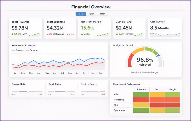
11. Financial Overview/Executive Dashboard
Using a Power BI finance dashboard, C-suite executives can get an exhaustive snapshot of their organization’s financial health without being overwhelmed by granular details. This dashboard combines the most critical financial metrics into a single view that enables quick assessment of business performance during board meetings or executive reviews.
Here are the key metrics you can include in your financial overview dashboard:
- Total revenue and expenses: Year-to-date, quarter-to-date, and month-to-date comparisons that show the overall financial trajectory.
- Net profit margin: The percentage of revenue that remains after all expenses, indicating overall business profitability.
- Cash position and runway: Current cash reserves and projected months of operation the company can sustain at the current burn rate.
- Key financial ratios: Current ratio, quick ratio, and debt-to-equity ratio to quickly assess financial stability.
- Budget vs. actual Variance: Percentage deviation from planned targets across major financial categories.
You can use different elements like these:
- KPI cards to display revenue, expenses, and profit at a glance
- Guge charts to show budget achievement progress
- Trend lines to analyze revenue and expense patterns over time
- Heat maps to highlight departmental or regional performance variations
Not sure which financial dashboards your organization actually needs? Book a call with our Power BI experts to design custom finance dashboards that consolidate ERP, accounting, and sales data into real-time executive reporting.
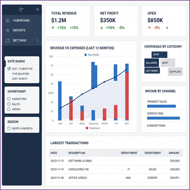
12. Profit and Loss Dashboard (P&L Dashboard)
The Profit and Loss Dashboard transforms traditional P&L statements into interactive visualizations that provide context and deeper insights into business profitability.
Unlike static P&L reports that lack context, Power BI P&L dashboards enable users to apply filters, drill down into transactions, and analyze trends across different time periods.
Key features of an effective P&L dashboard include:
- Revenue and expenses breakdown: Monthly, quarterly, and yearly comparisons showing performance trends.
- Income by channel: Revenue attribution across different sales channels, product lines, or business units.
- Overheads by category: Detailed categorization of operating expenses for better cost management.
- Largest transactions: Identification of significant sales and expense items requiring attention.
- Drill-down capabilities: Ability to click through from summary figures to individual transaction details.
Common analysis on P&L dashboards includes revenue and expense trends over time, income distribution across channels, overhead categorization, and transaction-level detail for anomaly investigation.
Power BI P&L dashboards are particularly valuable for these activities:
- Preparing consolidated financial reports in case you have P&L data across multiple QuickBooks Online accounts, locations, or entities in one centralized dashboard.
- Adding context to charts, such as trend charts, percentage columns, and variance analysis, helps you understand what raw financial figures signal.
- Filtering data by date, range, department, or cost center to find answers to specific questions and enhance interactive analysis.
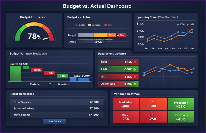
13. Budget vs. Actual Dashboard
The Budget vs. Actual Dashboard lets you track planned budgets against real-time expenditure. It thus facilitates proactive cost control and stronger financial discipline. This dashboard moves organizations beyond static spreadsheet comparisons, providing finance teams and budget managers with dynamic variance analysis.
Key features of budget vs. actual dashboards:
- Expense categorization: Breaking down variances by department, cost center, project, or GL account.
- Variance alerts: Visual indicators (red/green color coding) showing areas of overspending or underspending.
- Historical Spending Patterns: Year-over-year comparisons help create more accurate future budgets.
- Drill-down to Transaction Detail: Ability to investigate specific variances at the transaction level.
- Budget Utilization Percentage: Showing how much of the allocated budget has been consumed.
Finance teams use these budget vs actual dashboards to identify budget overruns faster than manual Excel-based processes and initiate corrective action before variances become material.
Common visualizations include:
- Gauge charts showing budget consumption progress toward 100%
- Bullet charts (horizontal gauge charts) comparing actuals to budget with variance bands
- Waterfall charts showing the budget starting point, variances by category, and the actual ending point
- Heat maps highlighting departments or projects with the largest positive/negative variances
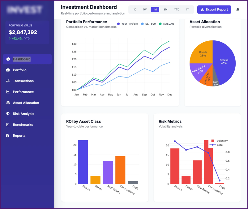
14. Investment/Portfolio Dashboard
The Investment Dashboard tracks investment performance, asset allocation, and portfolio returns, essential for financial institutions, corporate treasuries, and investment-focused organizations.
Key metrics to include in your investment dashboard:
- Portfolio value: Current total value compared to initial investment, showing absolute and percentage returns.
- ROI by investment type: Return on investment broken down by asset class (stocks, bonds, real estate, etc.).
- Asset allocation breakdown: Visual representation of portfolio diversification across different investment categories.
- Performance benchmarking: Comparison of portfolio performance against relevant market indices (S&P 500, NASDAQ, etc.).
- Risk metrics: Volatility measures, beta calculations, and Sharpe ratio for risk-adjusted returns.
Common visualizations include these elements:
- Charts showing portfolio performance over time
- Pie charts showing asset allocation distributions
- Detailed tables with individual position data
- Drill-through pages enabling deep-dive analysis of specific trades or holdings
Who uses investment dashboards:
- Hedge Funds: Tracking long and short positions with real-time performance monitoring.
- Corporate Treasury Teams: Monitoring company investments and managing cash reserves.
- Financial Advisors: Managing client portfolios and demonstrating performance to stakeholders.
You can select individual positions in the dashboard and drill down to detailed pages that show entry/exit points, holding periods, and transaction-level performance metrics.
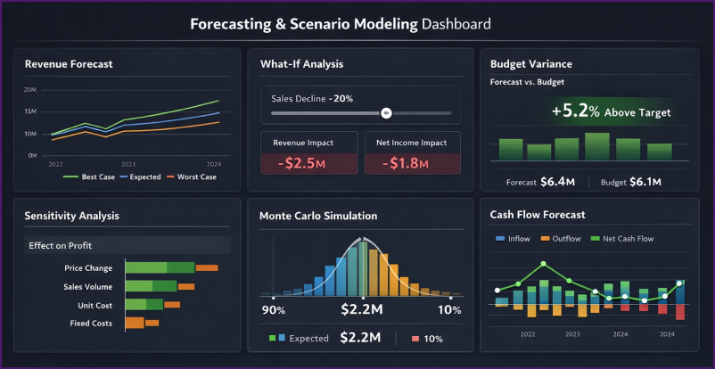
15. Forecasting & Scenario Modeling Dashboard
The Forecasting Dashboard uses historical data to predict future financial performance. Using this, you can mitigate risks and capitalize on opportunities through data-driven scenario planning.
This dashboard is critical for strategic planning, budget preparation, and risk management initiatives.
Key capabilities of forecasting dashboards include:
- Revenue and expense forecasting: Projections based on historical trends, seasonality, and growth assumptions.
- What if scenario analysis: Interactive modeling showing potential outcomes under different assumptions (e.g., “What if sales decline 20%?”).
- Budget variance projection: Forward-looking estimates of where actual performance will land relative to the budget.
- Sensitivity analysis: Testing how changes in key assumptions (pricing, volume, costs) impact financial outcomes.
- Monte Carlo simulations: Probabilistic forecasting showing range of potential outcomes with confidence intervals.
There are two common approaches for creating forecasting dashboards:
Approach 1: Forecasting Outside Power BI
Financial directors forecast in Excel or dedicated tools like Anaplan, then import and visualize forecasts in Power BI alongside actuals.
Approach 2: Forecasting in Power BI
Developers use Power BI’s built-in forecasting features, including AutoML capabilities, the LINEST DAX function for linear regression, or Python/R integration for advanced statistical modeling.
Typical scenarios modeled in forecasting dashboards include:
- Best case, worst case, and expected case revenue scenarios
- Impact of pricing changes on profitability and market share
- Effects of cost-cutting measures on net income and sustainability
- Cash flow forecasting under different collection and payment assumptions
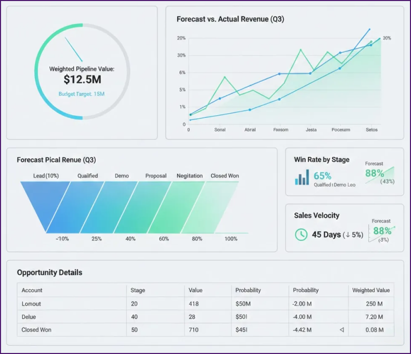
16. Sales Forecast Dashboard
Using the Sales Forecast Dashboard, CFOs and sales leadership predict future revenue based on pipeline data and historical conversion patterns.
This dashboard bridges the gap between sales operations and financial planning, enabling more accurate revenue forecasting.
Key metrics in sales forecast dashboards:
- Weighted pipeline value: Total pipeline opportunity value multiplied by stage-specific probability percentages.
- Forecast vs. budget comparison: Projected sales compared to budgeted targets.
- Win rate by stage: Conversion percentages at each pipeline stage for probability calibration.
- Sales velocity: Average time from opportunity creation to close, impacting revenue timing.
- Forecast accuracy: Comparison of previous forecasts to actual results for continuous improvement.
How sales forecasting differs from general forecasting:
Sales forecasting focuses specifically on revenue generation through the sales pipeline, while general forecasting may include expenses, cash flow, and other financial metrics. Sales forecasts typically update weekly or even daily as pipeline changes, whereas financial forecasts refresh monthly or quarterly.
Common approach to weighted pipeline forecasting:
Assign probability percentages to each pipeline stage:
- Lead: 10% probability
- Qualified: 25% probability
- Demo/Presentation: 40% probability
- Proposal: 60% probability
- Negotiation: 80% probability
- Closed Won: 100%
Multiply opportunity values by these probabilities and sum the results to calculate the weighted forecast.
Business application: Financial planning teams use sales forecast dashboards to predict quarterly revenue with greater accuracy instead of relying only on what sales teams feel. When integrated with expense budgets, these forecasts enable proactive cash management and resource allocation decisions.
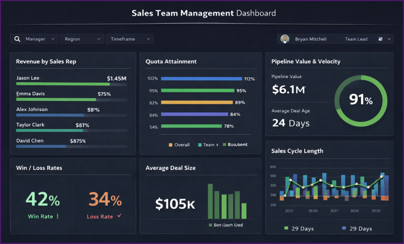
17. Sales Team Management Dashboard
The Sales Team Management Dashboard helps Finance Business Partners and Sales Managers track individual and team sales performance against targets with financial precision.
Finance teams use this dashboard to support sales organizations with data-driven insights for performance optimization and resource allocation.
Key metrics included in sales team dashboards:
- Revenue by Sales Rep: Individual contributor revenue attribution for performance ranking.
- Quota Attainment: Percentage of target achieved by each salesperson, team, and region.
- Pipeline Value and Velocity: Total value of opportunities in the pipeline and average time to close deals.
- Win/Loss Rates: Conversion percentages that show the effectiveness of sales efforts.
- Average Deal Size: Mean transaction value by rep, helping identify upselling success.
- Sales Cycle Length: Time from opportunity creation to deal closure, indicating efficiency.
Actionable insights from sales team dashboards:
- Identify high-performing and low-performing team members: Recognize high-performing sales team members and share knowledge with those who need help, such as training or pipeline additions
- Analyze performance trends: Track quarterly and monthly patterns to predict team quota achievement.
- Territory and product analysis: Understand which regions or products drive the strongest performance.
Finance Business Partners open this dashboard, apply manager filters, and immediately see the performance of every salesperson under that manager’s supervision. Clicking on an individual salesperson displays quarterly performance trends and detailed transaction history.
Using this dashboard, finance teams collaborate with sales leadership by providing objective data for compensation decisions, territory assignments, and resource allocation planning.
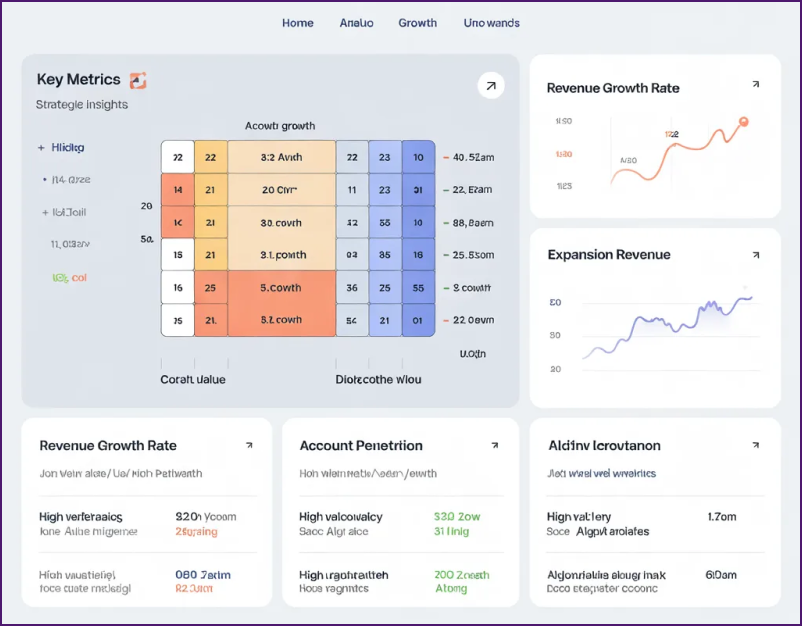
18. Account Growth Dashboard
The Account Growth Dashboard measures how effectively sales teams expand revenue from existing customers over time. You need this dashboard if you operate a B2B organization in which customer retention and expansion drive sustainable growth more effectively than new customer acquisition.
Key metrics for account growth tracking:
- Revenue growth rate by account: Year-over-year revenue change for each customer account.
- Account penetration: Percentage of potential products/services each customer has purchased.
- Expansion revenue: New revenue from existing customers through upsells and cross-sells.
- Customer lifetime value trends: How customer value evolves over their relationship with your company.
- Account health scores: Composite metrics predicting expansion or contraction risk.
Strategic insights from account growth dashboards:
Sales teams identify high-growth accounts to understand what drives expansion, then replicate these patterns with other customers. Conversely, shrinking accounts receive immediate attention to diagnose and address issues before complete churn.
Pattern recognition across growing accounts reveals common characteristics, such as industry vertical, initial purchase type, or engagement frequency. These insights inform customer acquisition targeting and onboarding processes.
Common visualizations:
- Growth matrix categorizing accounts by current size and growth rate (high value/high growth, high value/low growth, etc.)
- Waterfall charts showing account-by-account contribution to total growth
- Heat maps displaying growth patterns by customer segment or industry
- Trend lines for individual accounts showing revenue trajectory over 2-5 years
Finance Business Partners use this dashboard to support account planning discussions. Sales managers can then allocate resources toward accounts with the highest expansion potential.
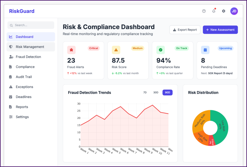
19. Risk and Compliance Dashboard
The Risk and Compliance Dashboard proactively safeguards your organization by monitoring financial risk indicators, fraud detection, and regulatory compliance in real time. This dashboard transforms compliance from a reactive checklist into a strategic advantage for Chief Risk Officers, compliance teams, and internal auditors.
Key metrics included in risk and compliance dashboards:
- Fraud Detection Scores: Automated detection of anomalous transactions and patterns indicating potential fraud activity.
- Compliance Audit Trail: Clear visual audit trail monitoring adherence to internal policies and external regulations (SOX, GDPR, etc.).
- Operational Risk Scores: Quantified risk scoring system prioritizing mitigation efforts by severity and probability.
- Regulatory Deadline Tracking: Visual tracking of upcoming compliance deadlines and filing requirements.
- Exception Management: Monitoring of policy violations and approval workflow compliance.
Business outcomes from risk dashboards:
- Proactive fraud prevention: Automated anomaly detection catches suspicious patterns before significant losses occur. Financial institutions using risk dashboards report faster fraud detection compared to manual review processes.
- Regulatory compliance assurance: Real-time monitoring keeps your organization audit-ready. It eliminates last-minute compliance scrambles before regulatory reviews.
- Risk quantification: Scoring operational risks helps executive teams prioritize which risks require immediate attention versus those that can be monitored. This data-driven approach to risk management improves resource allocation.
Industries that benefit most from risk dashboards include banking and financial services (fraud monitoring), healthcare (HIPAA compliance), publicly traded companies (SOX compliance requirements), and payment processors (PCI-DSS compliance).
Common risk indicators monitored:
- Duplicate payment attempts
- Unusual transaction amounts or frequencies
- Unauthorized vendor additions
- Policy approval bypasses
- Segregation of duties violations
- Dormant account activity
- Geographic anomalies (transactions from unexpected locations)
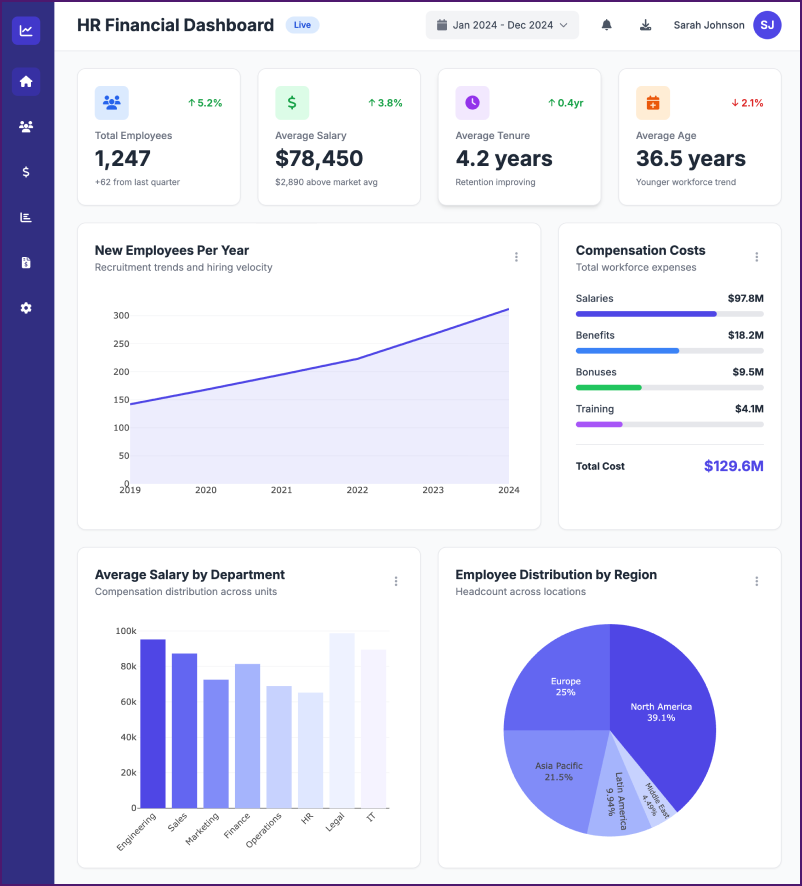
20. HR Financial Dashboard
The HR Financial Dashboard helps HR managers understand employee compensation trends, headcount costs, and workforce financial planning.
This dashboard bridges the gap between HR operations and financial planning, providing insights for strategic workforce management decisions.
Key HR financial metrics include:
- Total Compensation Costs: Tracking salaries, benefits, bonuses, and total cost per employee.
- Average Salary by Department: Understanding compensation distribution across organizational units.
- Average Duration at Company: Employee retention metrics impacting long-term compensation planning.
- New Employee Recruitment Rate: Tracking hiring velocity and associated onboarding costs.
- Compensation vs. Industry Benchmarks: Comparing your compensation packages to market standards.
Common visualizations in HR financial dashboards:
- KPI cards displaying total employee count, average salary, average tenure, and average age help HR teams understand workforce demographics.
- Area charts showing new employees per year reveal recruitment trends and help forecast future headcount costs.
- Bar charts breaking down employee distribution by region or department support budgeting decisions for different locations and business units.
- Tables listing the latest employees help HR keep track of recent hires and their compensation packages.
Business applications of HR financial dashboards:
HR departments use these dashboards to justify budget requests by showing data-driven workforce needs. Finance teams use them to forecast labor costs accurately for annual budgets. Executive leadership uses them to understand the financial impact of workforce decisions such as hiring freezes or expansion plans.
Organizations typically see 25-30% improvement in workforce planning accuracy when using HR financial dashboards compared to manual spreadsheet processes.
Strategic insights:
- Turnover cost analysis: Calculate the true cost of employee turnover by factoring in recruitment, onboarding, and productivity ramp-up
- Compensation competitiveness: Identify departments where salaries lag market benchmarks, contributing to attrition
- Headcount planning: Model the financial impact of different hiring scenarios for strategic workforce expansion
21. Customer Financial Analysis Dashboard
The Customer Financial Analysis Dashboard helps businesses understand which customer segments generate the most value and how customer demographics impact financial performance.
This dashboard is essential for companies wanting to optimize customer acquisition costs and focus sales efforts on high-value customer segments.
Key customer financial metrics:
- Average Customer Lifetime Value: Total revenue expected from a customer over their entire relationship with your company.
- Customer Acquisition Cost by Channel: Cost to acquire customers through different marketing channels.
- Average Purchase Frequency: How often customers make purchases, impacting revenue predictability.
- Revenue Per Customer Segment: Financial performance breakdown by customer demographics (age, income, location).
- Customer Profitability Score: Which customers are most profitable after accounting for service costs and discounts
Analytical capabilities in customer financial dashboards:
- Scatterplot analysis: Plotting customer age against average spend reveals which demographic segments are most valuable.
- Customer segmentation: Breaking down customers by income level, purchase frequency, and average order value helps identify your “ideal customer profile” for targeted marketing.
- ROI by acquisition channel: Understanding which marketing channels attract high-value customers versus low-value customers optimizes marketing budget allocation.
- Cohort analysis: Tracking how customer spending patterns change over time reveals opportunities for retention and expansion.
How Can You Build a Power BI Dashboard?
Creating a Power BI dashboard involves defining clear goals, connecting and cleaning data, and building accurate data models with meaningful visualizations. Interactivity, consistent formatting, and themes enhance usability, while publishing, sharing, and ongoing maintenance ensure the dashboard delivers reliable, up-to-date insights for decision-makers.
Here are the steps to follow:
1. Define the goals and gather the data
Establish the objectives and purpose of your dashboard. Define your target audience and the key metrics and insights you want to share. Next, begin gathering pertinent information from multiple sources. Spreadsheets, databases, internet services, and other data repositories can all be examples of this.
2. Connect to the Data Sources
Click “Get Data” in Power BI Desktop to establish a connection to your data sources. Power BI supports Excel, SQL databases, SharePoint, Salesforce, and many more data connectors. To connect, choose the suitable connector and adhere to the instructions.
3. Transform and Clean Data
Your dashboard data can be cleaned, transformed, and shaped with the Power Query Editor. You can build calculated columns, apply filters,
split columns, merge tables, and delete superfluous columns. This stage ensures that your data is in an appropriate format for analysis.
4. Create Data Models & Visualizations
In the Power BI data view, define relationships between tables to create your financial data models. Drag-and-drop is used to link related columns in this way. Accurately establishing these connections facilitates effective data visualization and analysis. Proceed to the report view and begin generating visualizations there. Numerous data visualization formats, including cards, tables, maps, and charts, are available in Power BI. Choose the right graphics to properly convey your facts. Axes, colors, and labels are just a few of the variables you can change to personalize the images.
5. Add Interactivity, Formatting , and Themes
Slicers, filters, and drill-throughs are some of the capabilities that can improve the interactivity of your Power BI dashboard. These let each user investigate the information and find insights according to their own needs. Applying formatting options, such as fonts, colors, backdrops, and layouts, will help your dashboard look more appealing. To keep your reports looking the same, you may also use pre-made themes or make your own custom themes.
6. Publish and Share
When your dashboard becomes complete, publish it to Power BI. Your dashboard can be made public or shared with other members of your organization. Make sure you include important stakeholders who may utilize the dashboard to make decisions when sharing and do so with purpose.
7. Monitor & Maintain
Track your Power BI dashboard’s usage and performance over time. After getting input from your teams, make the necessary corrections and enhancements. Plan frequent data refreshes to ensure that insights are current.
Build Custom Power Bi Finance Dashboards for Your Finance Team
Turn cash flow, P&L, forecasting, and KPI tracking into real-time executive dashboards with our Power BI experts.
How to Automate Finance Reporting With Power BI?
Power BI automates finance reporting by eliminating manual data extraction, transformation, and refresh cycles. With direct system integrations, reusable transformation logic, and scheduled refreshes, finance teams get real-time, accurate dashboards without relying on Excel-heavy workflows.
Step 1: Automate Data Extraction
Power BI has 250+ connectors with financial data sources like Anaplan, Salesforce, Microsoft Dynamics, SAP HANA, Oracle NetSuite, and QuickBooks. These connectors extract financial data from your source systems directly into Power BI without manual data pulls into Excel.
If your financial system isn’t among Power BI’s standard connectors, you can create custom Power BI connectors using the Power Query SDK. This ensures that even proprietary or legacy systems can feed data into your dashboards.
Common financial data sources supported:
- ERP systems (SAP, Oracle, Microsoft Dynamics)
- Accounting platforms (QuickBooks, Xero, Sage, FreshBooks)
- Planning tools (Anaplan, Adaptive Insights, Prophix)
- CRM systems (Salesforce, Microsoft Dynamics CRM)
- Cloud data warehouses (Snowflake, Azure Synapse, Google BigQuery)
Step 2: Automate Data Transformation
Power Query inside Power BI automates repetitive data transformation steps. You specify your data transformation logic once in Power Query, and these steps automatically apply every time your data refreshes.
Common financial transformations automated in Power Query:
- Converting transaction dates to fiscal periods
- Calculating running totals and period-over-period changes
- Mapping GL account codes to financial statement line items
- Consolidating data from multiple entities or currencies
- Applying exchange rates for multi-currency reporting
Step 3: Automate Data Refresh
Power BI allows you to schedule automatic data refreshes up to 8 times daily under a standard Power BI Pro license. For organizations that require more frequent updates, Power BI Premium supports refresh scheduling every 30 minutes.
Refresh scheduling considerations:
- Align refresh timing with source system batch processing
- Consider time zones for global organizations
- Balance refresh frequency against system performance
- Configure failure notifications for proactive issue resolution
Organizations using the Power BI Gateway can automatically refresh on-premises data sources, ensuring financial dashboards stay current even when data resides behind corporate firewalls.
What Makes a Great Power BI Finance Dashboard?
A great Power BI finance dashboard is fundamentally about smart data visualization that runs on autopilot, delivering clear insights without requiring time-consuming manual data analysis. While data visualization in finance can be complex, Power BI simplifies it through intuitive design principles.
Essential characteristics of effective financial dashboards:
1. Shows the right data to the right people
Role-based dashboards ensure executives see strategic KPIs while analysts access granular transaction details.
Finance directors need high-level profit margins and cash runway, whereas AR specialists require invoice-level aging reports. Well-designed dashboards apply row-level security, automatically filtering data based on user permissions.
2. Simple and clutter-free layouts
Financial data complexity doesn’t require visual complexity. The best dashboards use basic layouts with clear visual hierarchy, emphasizing critical metrics through size and position. Avoid cramming 15 visuals on one page when 6-8 well-designed charts communicate insights more effectively.
3. Always up-to-date for quick decisions
Automated data refresh eliminates the “How old is this report?” question. Stakeholders trust dashboards showing last refresh timestamps and schedule indicators. Real-time or near-real-time updates enable proactive decision-making rather than reactive responses to outdated information.
4. Fast and interactive for quick answers
Slow dashboards discourage usage. Optimize data models by removing unnecessary columns, using appropriate data types, and implementing incremental refresh for large datasets. Interactive filters let users answer their own questions without creating custom reports for every scenario.
5. Works on every device
Mobile-responsive design isn’t optional for modern financial dashboards. CFOs need to check the cash position at airports. Sales managers review pipeline dashboards from client meetings. Design for a 16:9 desktop ratio while ensuring critical KPIs remain visible on mobile layouts.
If your current dashboard doesn’t meet these standards or makes financial analysis harder rather than easier, partnering with a data visualization consultant can transform it into a strategic asset that genuinely improves decision-making quality and speed.
Conclusion
In conclusion, Power BI offers transformative benefits for finance and accounting teams by providing comprehensive data visualization and analytics capabilities. These dashboards enable real-time monitoring of key financial metrics like cash flow, profitability, tax compliance, and operational expenses. By harnessing Power BI’s intuitive features, finance professionals can drive strategic decision-making, optimize resource allocation, and enhance financial transparency across the organization.
Through personalized dashboards tailored to specific needs, stakeholders gain valuable insights into revenue streams, expense breakdowns, and overall financial health. The ability to consolidate data from multiple sources, coupled with interactive visualizations, empowers finance teams to deliver actionable intelligence efficiently. With Power BI, finance and accounting functions evolve from mere record-keeping to becoming strategic partners driving organizational success.
Frequently Asked Questions on Power BI Finance Dashboards
What is the best Power BI dashboard for CFOs?
The Financial Overview/Executive Dashboard provides CFOs with essential high-level KPIs in a single view. This dashboard typically includes total revenue and expenses, net profit margins, cash position and runway, key financial ratios, such as current ratio and debt-to-equity, and budget variance percentages. CFOs use this dashboard for board presentations, quarterly reviews, and quick status checks on overall financial health without diving into granular transaction details.
Can Power BI replace Excel for financial reporting ?
Power BI complements Excel rather than replacing it entirely. Excel remains excellent for detailed calculations, financial modeling, and ad hoc analysis that require complex formulas. Financial reporting dashboards excel at visualizing data, automating reporting processes, and consolidating data from multiple sources into unified dashboards. Most finance departments use both tools strategically: Excel for financial modeling and forecasting, Power BI for accounting, reporting and visualization.
How long does it take to build a Power BI financial dashboard?
Building time varies based on dashboard complexity and the availability of data sources. A basic dashboard with a single data source can be built in 1-2 weeks. Intermediate dashboards combining 2-3 data sources with moderate complexity typically take 2-4 weeks. Enterprise-grade dashboards with multiple data sources, complex calculations, and extensive customization may require 4-8 weeks. Using pre-built accounting dashboard templates can reduce development time by 50-70%.
